The story of the logo
by Barry Pearce, Founder, BSIP.
The creation of a logo for the project was initially problematic. Often projects use outlines of particular bowed string instruments. These instruments however, tend to represent a given time period in a particular geographic region; the violin, Europe, 1500-present; the viola da gamba, Europe, 1475-c.1800. What I wanted to achieve was a logo that matched the project remit - something that represents the instruments of both Europe and Asia equally, and captures the essence of bowed string instruments. I mulled on this for months and various designs went nowhere and all seems unsatisfactory. So I stripped the ideas right back to the common element. A string and a bow. The concept of bowing is key to all of these instruments, both binding them together as well as completely shaping their sounds. When a bow is used to transfer energy into a string, an interesting motion is set up that is, as far as I am aware, unique to all bowed string instruments, and exists on all such instruments regardless of their origins. This motion is known as Helmholtz motion.

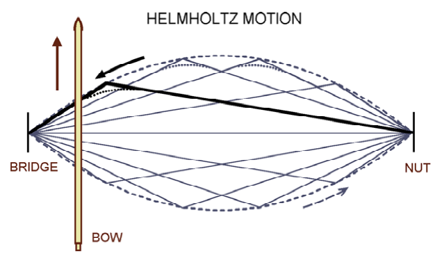
Illustration of Helmholtz motion by Knut Acoustics.
Helmholtz motion is named after its discovery by Hermann von Helmholtz who published his findings in 1884.
A rosined hair will grip the string and pull it. At some point tension overcomes friction and the string slips backwards. This repeated cycle of grip and slip creates the vibration. However, this vibration is not a clean symmetrical vibration that we consider of free strings such as those on plucked instruments. Instead, Helmholtz noticed that there is a kink that travels up and down the string.
Of course reality is rather more complicated than this simplistic view, and simple diagram, but it does describe the essence of what is happening.
If you are interested, Knut Acoustics has many good articles on Helmholtz motion. In particular K. Guettler: The Helmholtz motion. A brief introduction to the concept of "Helmholtz string motion" is a great place to start.
High speed cameras can capture the string in motion, revealing to us that which is too fast for the eye!
The video opposite shows Helmholtz motion being established in a bowed string. Although the instrument is an electric violin, the motion shown is the same on all bowed string instruments. If ever you wondered if you really did need so much space between the strings...
I highly recommend watching this video full screen!

A 4/4 violin has a string scale length of 325-330mm. The video clearly shows the excursion proportionally to the length is quite small. Naturally in order to present the information in a reasonable sized diagram this movement is shown as being much wider than it really is. Whilst there are no rules regarding logo aspect ratios, computers love squares. Icons are pretty much exclusively square and so on.
To transition the Helmholtz motion to something beyond a blurred horizontal line I have taken the step of expanding the excursion so that the result is more or less happening in a square.
Here we have a representation then of a single string experiencing Helmholtz motion. Not a great logo and very dynamic! What I needed to do was be able to make a more static image. Initially I tried something based on the Knut acoustics illustration but it just didn't work at all.
Then it struck me - I can represent time in a similar manner to radar. As time moves on so the solidity and colour fades. Rather than a simple fade (which does not scale well down to smaller sizes) I hit upon the notion of changing the colour and the opacity, so with the recent string position shown as dark blue the oldest time would be shown faded and changing to cyan.
With this simple idea I was now able to represent a string moving through space and time - thus capturing the idea Helmholtz motion in a form that was now looking more like a logo!

The Final Logo
Here it is! The purple line representing the string at rest, with the blue-cyan representing Helmholtz motion in both time and space. I finally had the image which I feel captures the essence of bowed string instruments across the entire globe. And then it struck me - having squared up the Helmholtz motion the resulting logo is almost a little globe-like. It reminded me of the globe represented by longitude and latitude lines . The logo is not perfectly square. It is actually ever-so-slightly wider than high. The logo traces the outline of a slightly squashed circle. The Earth isn't actually a perfect sphere. It is a slightly squashed sphere known as an oblate spheroid. I would of course like to claim this relationship was purposeful design, but it just happened that way. When I realised the globe associations, I loved the logo all the more!
That's it - the logo was born!